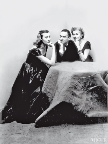
“My friend, it’s Modern,” Alexander Liberman, the legendary Editorial Director of Condé Nast, would say whenever someone challenged his judgment. In fact, his love affair with Modernism informed his twin vocations, as publishing kingmaker and as an artist. Surveying the protean accomplishments of this relentlessly charming man, It’s Modern.: The Eye and Visual Influence of Alexander Liberman (Rizzoli), by Charles Churchward (a former Design Director at Vogue and Vanity Fair), offers graphic proof of the consistency of his vision, which married the iconoclasm of Russian Constructivism with old-world savoir faire and American know-how. It is also a disciple’s affectionate tribute to an elusive master.
Born in Kiev in 1912, Liberman attended European boarding schools but learned more from his actress mother’s Parisian circle, which included Cocteau and Léger. After his studies, he landed a job at VU, where his collage-like covers grabbed the spotlight. On the Riviera, Liberman met fellow émigré Tatiana du Plessix. The story of their escape from war-torn Europe makes for compelling reading. But so does the reinvention of this couple in New York, where Tatiana designed hats for Saks, and Alex rose rapidly through the ranks at Condé Nast. Liberman went on to take a treasure trove of photographs of artists he admired, from Marlene Dietrich to Alexander Calder. That he also found time, while infusing Vogue with new talent (e.g., Irving Penn), relaunching Vanity Fair, and the like, to pursue a career as an artist is remarkable. Liberman’s paintings and monumental steel sculptures were collected by major museums. The critics, however, largely ignored him. Certainly his Circlist paintings are ripe for reevaluation. Visually enthralling, they are infused with an almost mystical authority—as smoothly ungraspable, in their way, as Liberman himself.
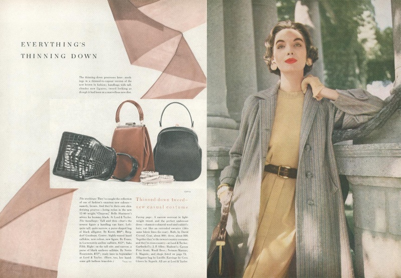
Here is a selection of Liberman’s covers and spread for Vogue:
Source vogue.com


Oh those halcyon years that included Avedon, Penn, Grace Coddington among others…
I absolutely love some of the old fashion magazine’s cover designs! I like the simplicity of the design, the soft, pastel colours and that it is not clattered with lots of text but with small fonts to complete the composition. I’m a big fan of anything retro too! Lovely blog – well done!